A Norwegian study determined that reading behavior on screens deviates substantially from reading on paper. (Read more here about this topic – Design: Screen vs. Print). This fact tells us that the design of presentations on screen in comparison to printed documents must be different.
Here are the most important tips for design …

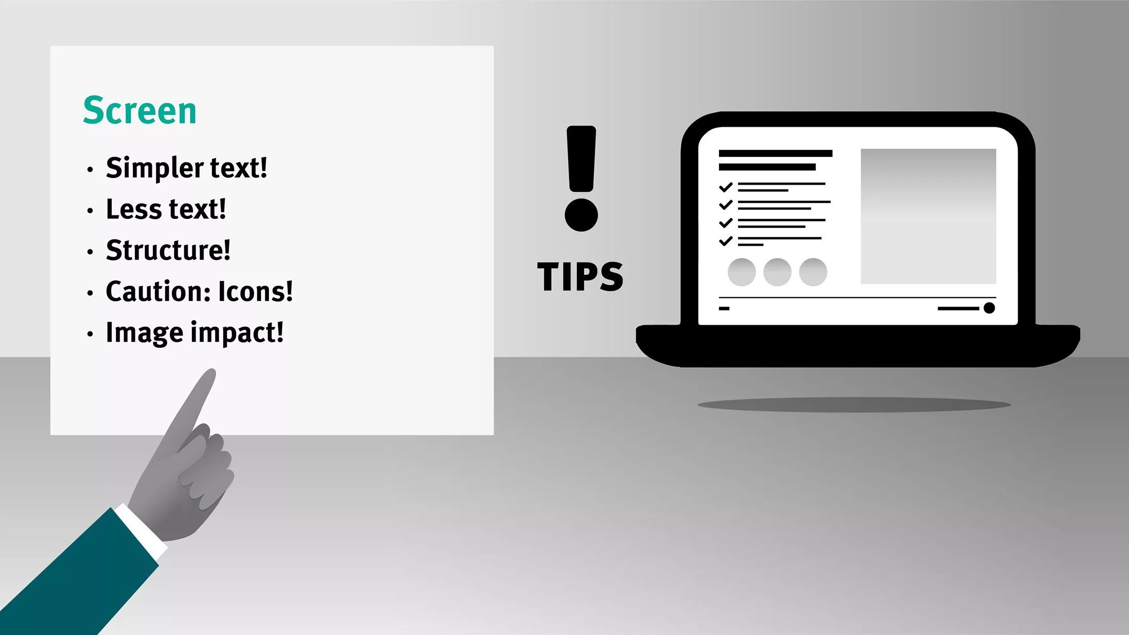
Tips for Presentations on Screens
- Simpler text: Meet the lack of attention on screens by keeping text simple. Communicate in short, concise sentences!
- Less text – more slides: A further theme is the amount of the depicted contents. Not recommended are presentation slides crowded with text. It is better to distribute the text on several slides and to lighten it up with images or graphic elements.
- Structure! Well-structured contents are grasped better. Important elements can be highlighted, but be careful here: If too much is highlighted resp. optically emphasised, this can be confusing.
- Caution! Icons: These mostly little depictively symbolic graphics are now in voque – fill a page fast with icons and a few headlines, but beware – trivial icons are increasingly common – and the frustration of the reader ( “What could this icon mean?“) is preprogrammed.
- Image impact! Unedited, semiprofessional pictures on the screen unfortunately come across as unprofessional. Leave your photos to a photographer or use stock photos. If you want the imagery of your company communication to be consistent, even with professional pictures/stock photos, there is no way around image editing by a specialist.

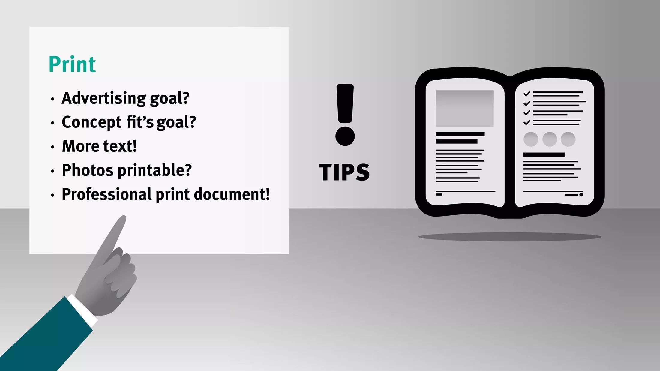
Tips for printed documents
- Define the advertising goal! Clarify in the first step for what you would like to use the documents (target group, communication goal) and the contents that shall be communicated. To follow, format and scope (number of pages) should be considered. Ideally, I am already involved as your professional designer at this point in time to help with the concept establishment. How does it continue? Learn more here about “Cooperation with a Creative Partner“.
- Concept? Verify whether the concept of the document is in agreement with the planned investment. One example: How often will the document be used? Is a special protective coating necessary?
- More Text! In print is not only more, but also more complex text possible. Studies confirm that written text on paper is better assimilated. Read more about this topic here: Screen vs. Print
- Caution with photos! As already mentioned, semiprofessional images and photos fail to unfold their optimal impact – in most cases they are not suitable for print. You think your mobile phone takes nice pictures? The screen of your smart phone is not very big. When you open the same photo on a larger screen, then flaws like blur or fuzziness are first visible – which means the image quality is bad. For high quality print both are indeed important: High resolution AND good image quality.
- Print documents! Without professional print documents you will not be satisfied! Unfortunately, I hear again and again about attempts to create print documents with Office programs. Yes, it is possible to make a PDF with many programs, but there is in this case NO colour management. The resulting print colours are rather by chance – particularly for colours not adjusted by a calibrated monitor. Often these documents in RGB mode are automatically converted for print in CMYK. (Read more here about the topic Screen, as well as RGB vs. CMYK)
Would you like professional support for your company presentations or marketing materials?
I am happy to assist you!


