Advantages and Disadvantages of Presentation on Screen or Paper
Design is a transport medium for information, of which writing is a natural component. It so happens that we read and understand text in different media in different ways. A Norwegian study (Mangen 2013)* ascertained that the written word on screen is not as well-processed. Deep understanding and memory suffer through on-screen reading in comparison to printed text.
This interesting phenomenon refers to altered reading behavior. On computer, tablet and mobile phone, we »scan« texts with our eyes for relevant information and fly over whole passages. Furthermore, we are accustomed to jump quickly from website to website resp. from post to post.

Advantages?
The great advantage of print is the carrier material – usually paper. It offers additional sensory, tactile and spatial information. Indeed, the grammage, coating, smell and much more are not consciously perceived – but these stimuli nevertheless exist and positively influence the intake of information on paper. In a printed work, we can also closely examine the page contents and orient ourselves by leafing through the pages.
Moreover, Anne Mangen, David Miall and Don Kuiken* were able to determine, that paper activates more strongly our emotions. The better intake of printed text intensifies perceptions that are transported by the written word.
Everything digital?
Through the advancing digitalisation, less is printed and more content is being solely transported over the screen. The advantages are obvious: Digital documents are changeable (e.g. Power Point), no print deadlines, no thinking about the printing process, no professional print documents, etc.
With the knowledge about differing perception, it is somewhat easier to decide what shall be printed and what shall only be digitally communicated. Moreover, it is important to comprehend where design for screen and print differ, in order to facilitate the advantages of the respective medium.
Differences in Design
Alone the fact that we perceive and absorb texts in various media differently, suggests that design presentation on screen must be different than for printed matter.
Typographie
Great variations exist in the area of typography. There are, for example, font types especially conceptualised for screens resp. for print. Important to consider is the type size: It should be chosen according to medium. Who has not ever printed his/her Power Point presentation to realise that the type size, apparently optimal for the screen, was much too big in print? Good legibility is the sum of the appropriate font type, macro- and microtypographical knowledge.
Format
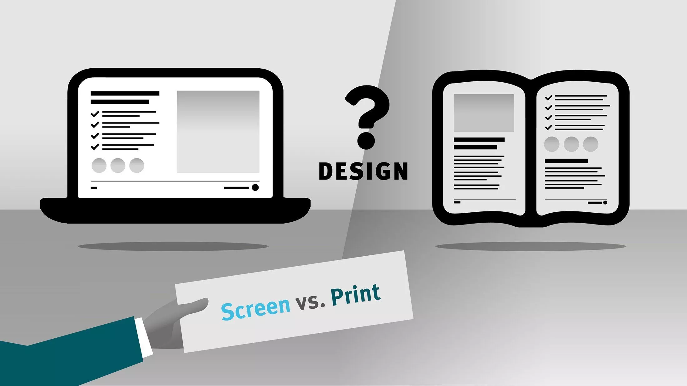
Also the format is a crucial distinctive characteristic. Here there are several points to consider: Classic screen presentations (Power Point) are defined in horizontal format (usually 16:9). For printed documents, other formats are customary, such as 21×28 cm for magazines/leaflets or 10×21 cm for a classic folder. A PDF-file in vertical format (e.g. A4) is for desktop/laptop only moderately suitable, somewhat better on a tablet (portrait mode), unsuitable for mobile phones, as the PDF mostly must be zoomed to be legible.
Summary
Screen and print are fundamentally and obviously different. The advantages and disadvantages are influenced respectively by specific design rules, which optimise the information reception.
You are looking for a profi for screen AND print design?
I am pleased to be available for you and look forward to your inquiry!
*) Quellen:
Anne Mangen et.al: Reading linear texts on paper versus computer screen: Effects on reading comprehension, International Journal of Educational Research, Volume 58, 2013, Pages 61–68
Christensen, Arnfinn: “Paper beats computer screens”, 13. März 2013, https://sciencenorway.no/computer-forskningno-norway/paper-beats-computer-screens/1383692


